
Penn United
Categories
Product Design
Client
Penn United
Project
Website Redesign
Services
UX/UI Design
Year
2025
Tools
Figma, Content Snare
Penn United organizes across divides — race, class, geography — and their website was failing all of them. Dense content, buried local chapters, and navigation nobody recognized. Three months, four designers, one design system built from scratch.
My Role
As part of a four-person design team, I owned the visual design and design system over three months, collaborating across research, information architecture, and stakeholder alignment.
The Challenge
Penn United needed a website that could communicate a complex, mission-driven message to a broad audience — while making it easy for users to find local chapters, take action, and engage with their community. The redesign had to balance content density, accessibility, and the resource constraints typical of a nonprofit.
Key Insights
Through stakeholder conversations and a content audit of the existing site, we identified four key patterns:
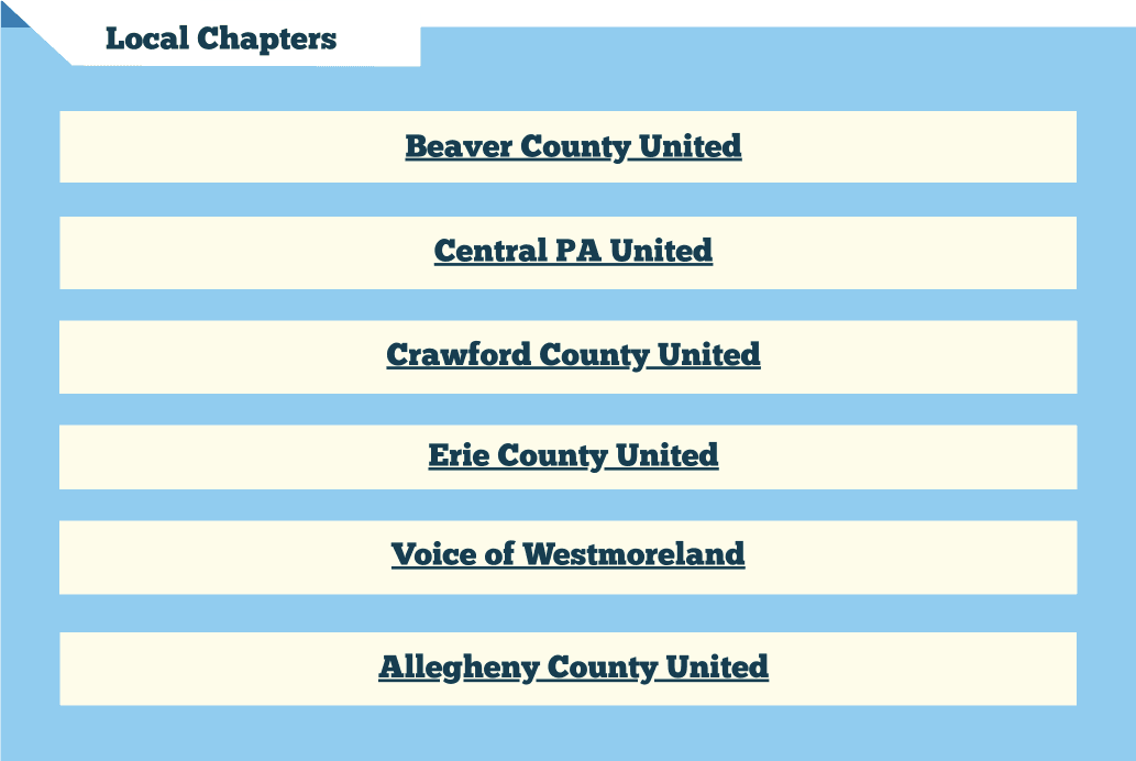
Community resources were buried, requiring multiple clicks before users could engage locally.
Dense, unstructured content made it hard for first-time visitors to understand the mission or find next steps.
Calls to action were inconsistently labeled and not clearly surfaced across the site.
Navigation relied on internal terminology rather than how users actually think about the organization.

Style Guide
To support clarity, consistency, and approachability across the site, a visual style guide was created to reinforce hierarchy, usability, and a sense of guided exploration. Design decisions were informed by research insights around content density, navigation clarity, and the need to make information feel accessible rather than overwhelming.

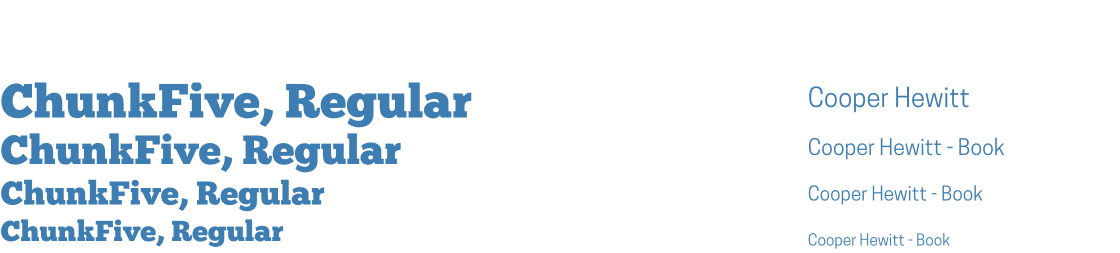
Typography
A clear typographic hierarchy improves scannability across content-heavy pages. Headings guide users through information step-by-step, while body text remains highly legible to support learning and comprehension.
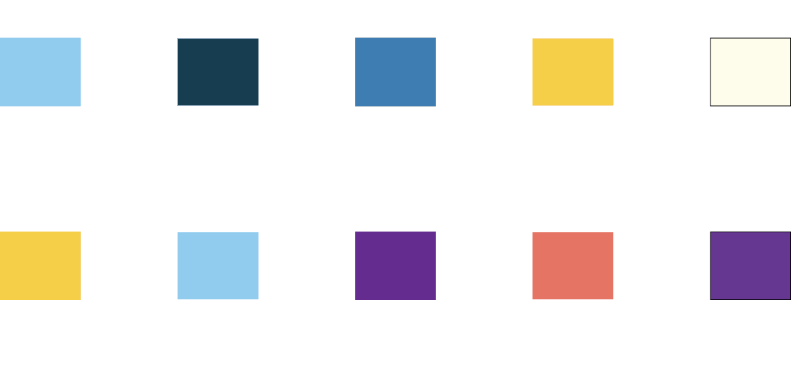
Color System
The color palette balances neutrality and contrast. Softer background tones reduce visual fatigue, while accent colors are reserved for calls to action and key interactive elements, helping users quickly identify next steps.
Folder-Inspired UI Components
Buttons and card components were intentionally designed to resemble folders. This metaphor draws from familiar organizational systems, subtly reinforcing the idea of exploring, opening, and learning as users navigate the site.
Cards suggest grouped information and encourage exploration
Folder-like buttons signal “open to learn more” rather than “perform an action”
This visual language helps reduce intimidation on content-heavy pages by framing information as organized, explorable, and learnable.

Navigation Elements
Navigation styles support this metaphor by clearly grouping related content and surfacing priority sections, making it easier for users to understand where information lives and how to access it. Together, these elements create a cohesive visual system that supports learning, exploration, and user confidence while navigating the site.
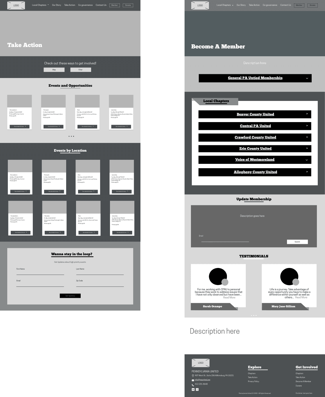
Final Design Overview
The final redesign prioritizes clarity, approachability, and scalability. By pairing a structured navigation system with a learning-oriented visual language, the site supports both first-time visitors and returning members seeking local engagement.
Desktop Screens
Mobile Screens


Reflections
This was my first time building a formal design system, and it changed how I think about design. Codifying the folder-inspired UI language into reusable components — cards, buttons, navigation — turned a visual idea into a scalable pattern. It also taught me that design systems aren't just visual references; they're communication tools for developers and stakeholders. After launch, stakeholders reported that first-time visitors could locate their local chapter and find ways to get involved without assistance — the core failure the redesign was built to fix.

